STYLE COMPARISON
Pencil Sketch VS Photorealistic: which portrait style should you pick?
Both turn your photo into a custom portrait. Here's the honest difference and when to choose each one.
Pencil Sketch vs Photorealistic: what's the difference?
Pencil Sketch vs Photorealistic: both turn your photo into a custom portrait, but the feel is different. Pencil Sketch leans into intimate, hand-drawn, quietly personal; Photorealistic leans into clean, editorial, magazine-quality. Pick Pencil Sketch for minimalist cards and framed bedside prints. Pick Photorealistic for professional portraits and printed photo cards.
Same photo, both styles
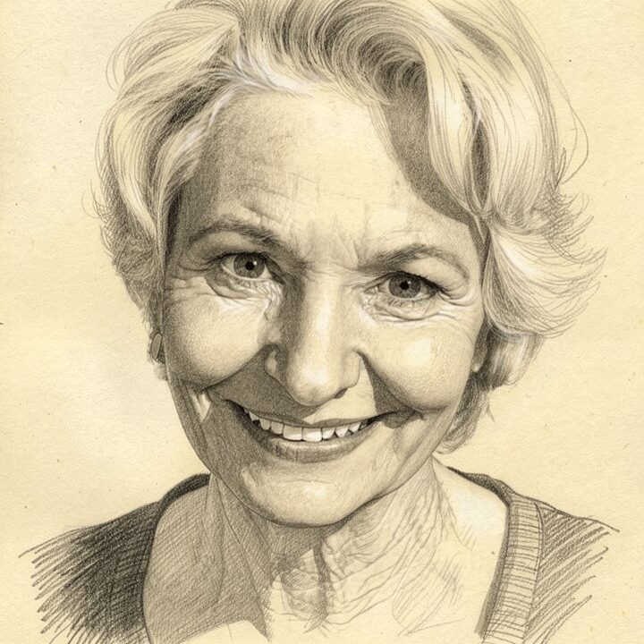
Pencil Sketch
Hand-drawn graphite, intimate and personal
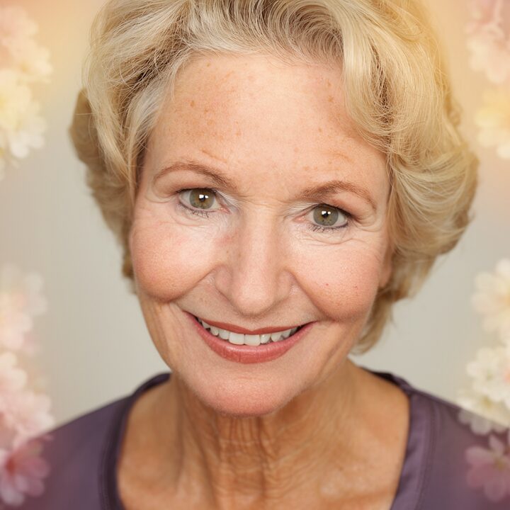
Photorealistic
Editorial portrait, lightly retouched
Pick Pencil Sketch if… / Pick Photorealistic if…
Pick Pencil Sketch if…
- Pick pencil sketch for an intimate hand-drawn keepsake on cream paper.
- Pick pencil sketch for quiet bedside prints and minimalist gallery frames.
- Pick pencil sketch when the recipient loves hand-drawn art.
Pick Photorealistic if…
- Pick photorealistic for a clean editorial portrait that looks like a real photo.
- Pick photorealistic for printed photo cards and holiday announcements.
- Pick photorealistic when the recipient wants no artistic stylization.
At a glance
| Attribute | Pencil Sketch | Photorealistic |
|---|---|---|
| Medium | graphite pencil on textured cream sketch paper | retouched DSLR studio photograph with 85mm bokeh |
| Palette | monochrome graphite from deep darks to paper-white highlights | true-to-life skin tones with warm neutral grade |
| Mood | intimate, hand-drawn, quietly personal | clean, editorial, magazine-quality |
| Best for | minimalist cards and framed bedside prints | professional portraits and printed photo cards |
| Price | $9–$89 | $9–$89 |
Common questions
Which looks most like the photo?
Which is better for an older recipient?
Which works on mugs?
Which is more artistic?
“I gave this to my best friend for a milestone birthday and they genuinely couldn't speak for a minute.”
STILL DECIDING?
Still deciding? Preview both free
Upload one photo. Preview any of our 29 styles free. No signup.
Preview both freeLast updated: 2026-05-22