STYLE COMPARISON
Renaissance VS Impressionist: which portrait style should you pick?
Both turn your photo into a custom portrait. Here's the honest difference and when to choose each one.
Renaissance vs Impressionist: what's the difference?
Renaissance vs Impressionist: both turn your photo into a custom portrait, but the feel is different. Renaissance leans into regal, classical, court-portrait gravitas; Impressionist leans into dreamy, sunlit, garden-warm. Pick Renaissance for history buffs and library walls. Pick Impressionist for Monet fans and bright entryway prints.
Same photo, both styles
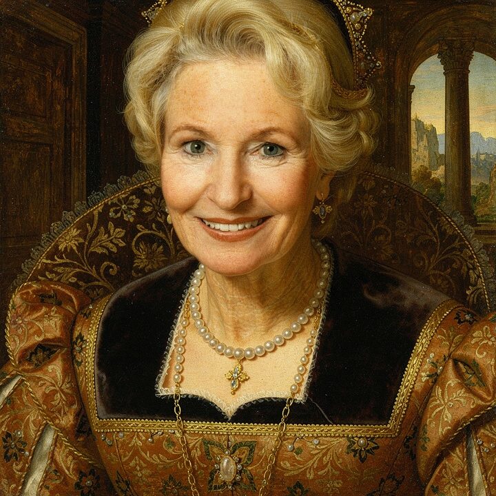
Renaissance
A Renaissance royal portrait — museum-worthy
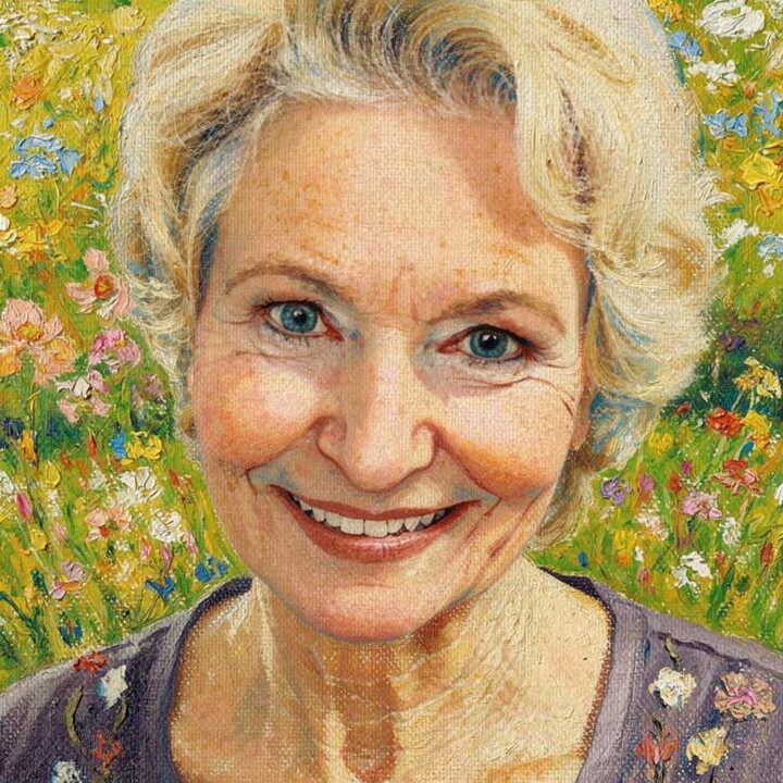
Impressionist
Dreamy impressionist brushwork in warm sunlight
Pick Renaissance if… / Pick Impressionist if…
Pick Renaissance if…
- Pick Renaissance for meticulous 16th-century oil glazes on wood panel.
- Pick Renaissance for formal study walls and classic interiors.
- Pick Renaissance when the recipient loves historical precision.
Pick Impressionist if…
- Pick impressionist for sunlit Monet-style broken-color brushwork.
- Pick impressionist for bright entryways and garden-themed interiors.
- Pick impressionist when the recipient loves dappled-light outdoor scenes.
At a glance
| Attribute | Renaissance | Impressionist |
|---|---|---|
| Medium | Flemish oil glaze on wood panel with sfumato edges | broken-color oil paint on primed linen canvas |
| Palette | deep burgundy, forest green, aged gold, ivory | cerulean, rose madder, cadmium yellow, sap green |
| Mood | regal, classical, court-portrait gravitas | dreamy, sunlit, garden-warm |
| Best for | history buffs and library walls | Monet fans and bright entryway prints |
| Price | $9–$89 | $9–$89 |
Common questions
Which is brighter?
Which is more formal?
Which suits a garden room?
Which has more detail?
“I gave this to my best friend for a milestone birthday and they genuinely couldn't speak for a minute.”
STILL DECIDING?
Still deciding? Preview both free
Upload one photo. Preview any of our 29 styles free. No signup.
Preview both freeLast updated: 2026-05-22