STYLE COMPARISON
Impressionist VS Watercolor: which portrait style should you pick?
Both turn your photo into a custom portrait. Here's the honest difference and when to choose each one.
Impressionist vs Watercolor: what's the difference?
Impressionist vs Watercolor: both turn your photo into a custom portrait, but the feel is different. Impressionist leans into dreamy, sunlit, garden-warm; Watercolor leans into gentle, dreamy, handmade, luminous. Pick Impressionist for Monet fans and bright entryway prints. Pick Watercolor for greeting cards and sentimental keepsakes.
Same photo, both styles
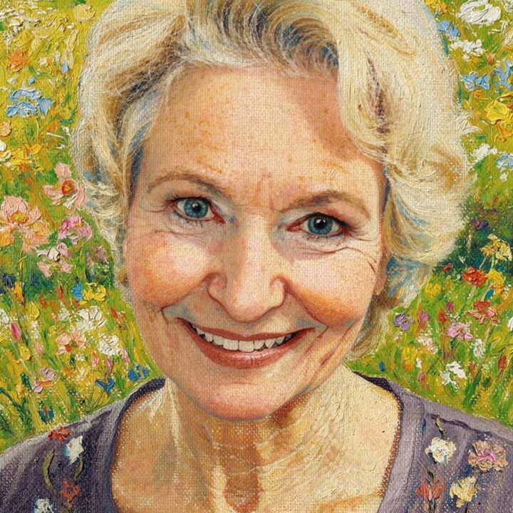
Impressionist
Dreamy impressionist brushwork in warm sunlight
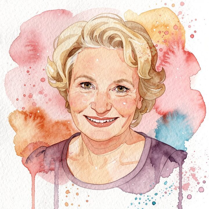
Watercolor
Soft, dreamy washes that say 'handmade with love'
Pick Impressionist if… / Pick Watercolor if…
Pick Impressionist if…
- Pick impressionist for Monet-style oil brushwork and garden-sunlight palette.
- Pick impressionist for framed canvas wall art in bright rooms.
- Pick impressionist when the recipient loves visible impasto strokes.
Pick Watercolor if…
- Pick watercolor for transparent washes and a soft handmade card feel.
- Pick watercolor for greeting cards and nursery prints.
- Pick watercolor when the recipient loves pastel paper-based art.
At a glance
| Attribute | Impressionist | Watercolor |
|---|---|---|
| Medium | broken-color oil paint on primed linen canvas | watercolor wash on cold-pressed cotton paper |
| Palette | cerulean, rose madder, cadmium yellow, sap green | soft rose, blush pink, warm ochre, cerulean |
| Mood | dreamy, sunlit, garden-warm | gentle, dreamy, handmade, luminous |
| Best for | Monet fans and bright entryway prints | greeting cards and sentimental keepsakes |
| Price | $9–$89 | $9–$89 |
Common questions
Which uses more paint?
Which suits a canvas print?
Which works on a card?
Which is more modern?
“I gave this to my best friend for a milestone birthday and they genuinely couldn't speak for a minute.”
STILL DECIDING?
Still deciding? Preview both free
Upload one photo. Preview any of our 29 styles free. No signup.
Preview both freeLast updated: 2026-05-22